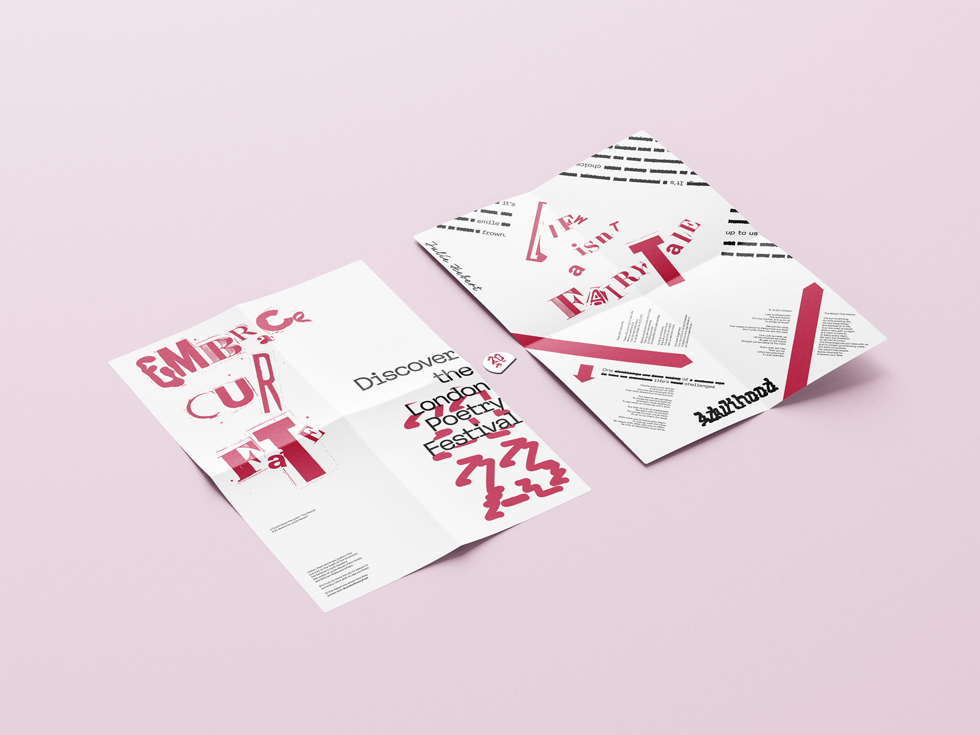
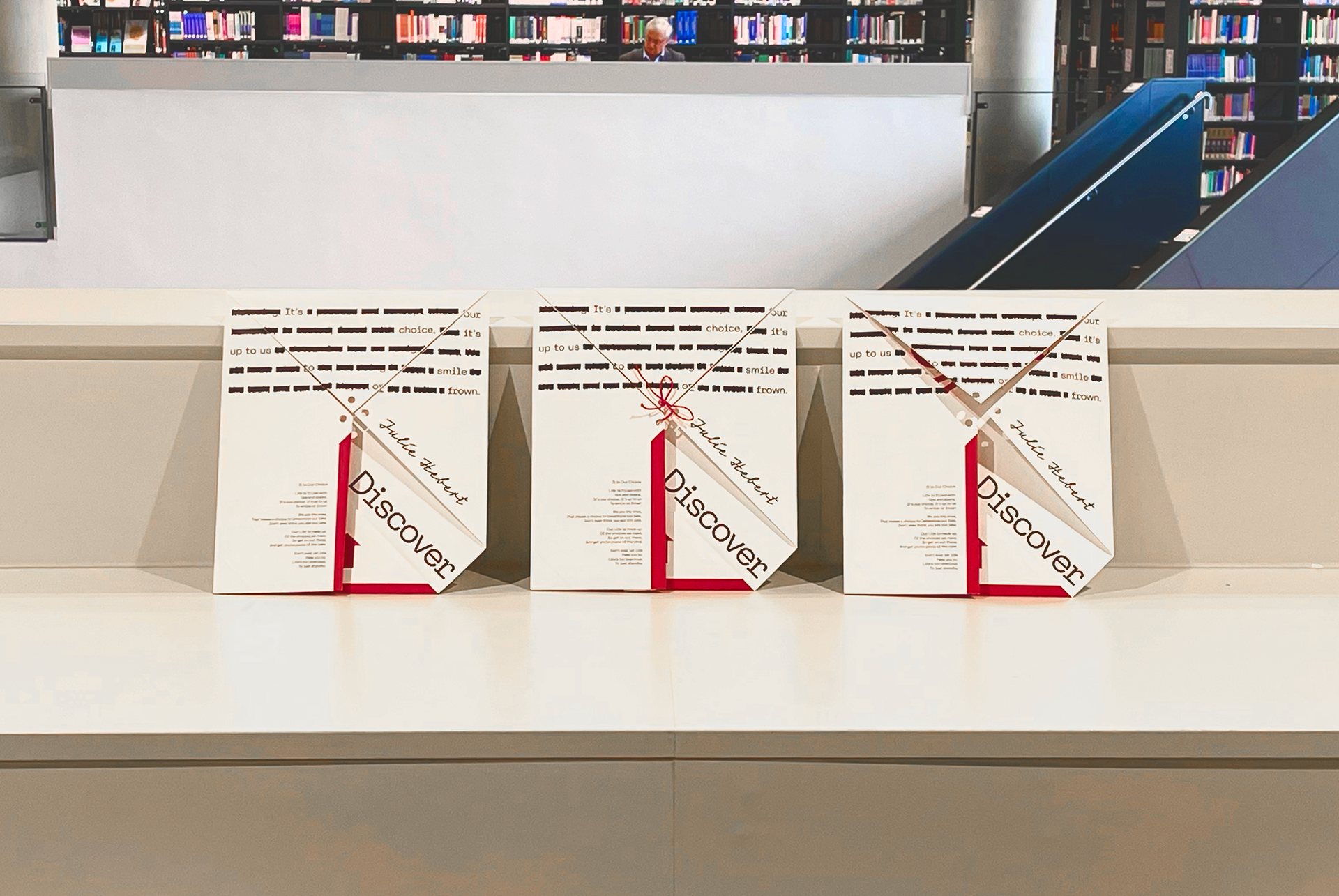
The poems were all from an Author called Julie Hebert which was selected by me, as the brief had free choice on who you could promote. I felt that I resonated with these on a personal scale through their complex underlying meanings and paired that with a fairly complex folding design.
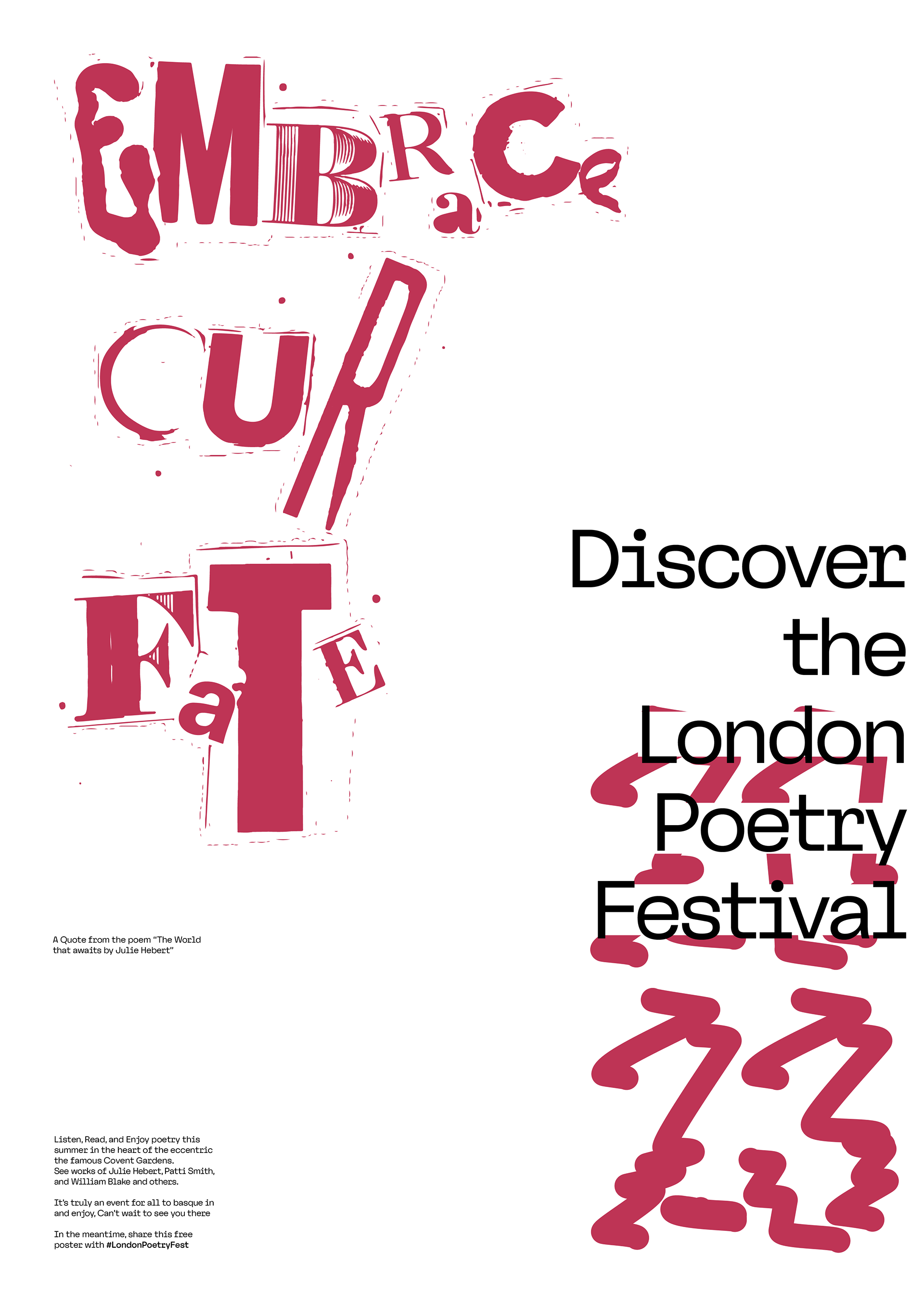
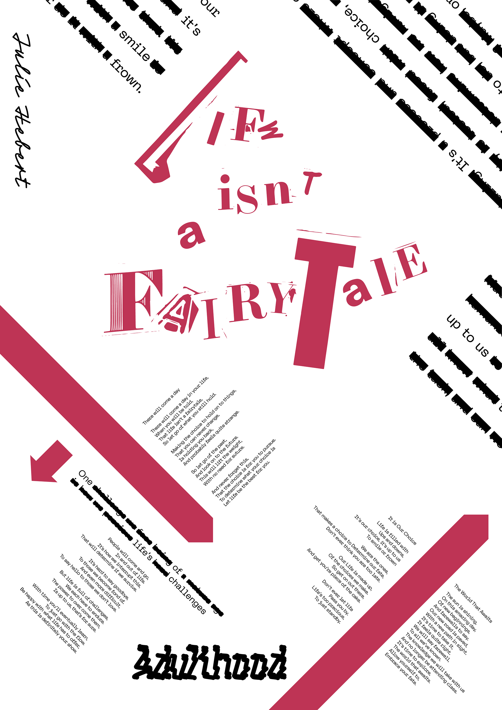
The below image shows how this little 'parcel' would fold which could be tied up or used a sticker to seal as a fun way of adding print into people's daily lives to promote the festival.
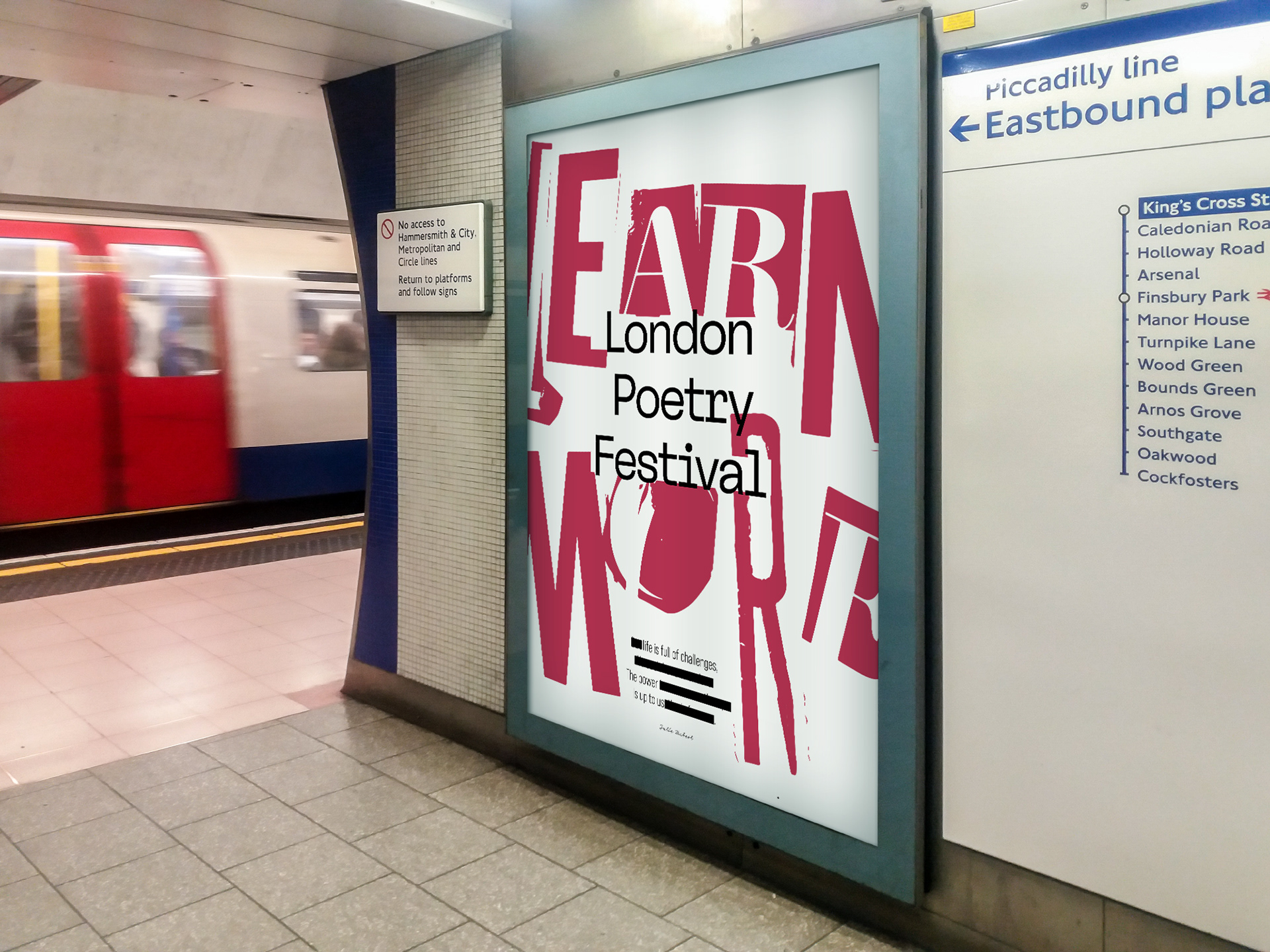
Some OOH design was also done which was positioned in London as it's the location for the festival. This used a similar style but was more bold in it's visual deployment since unlike the poster it was flat and non-interactive.